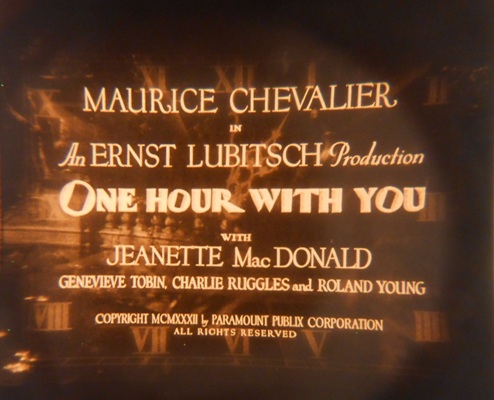
 Our new season begins on Wednesday with One Hour with You. If you’ve never seen it, you have a wonderful, adult, emotionally resonant musical to look forward to. If you have seen it before—say, on Criterion’s budget-line Eclipse DVD or in a 16mm print at the old LaSalle Bank Cinema—you haven’t really seen it either.
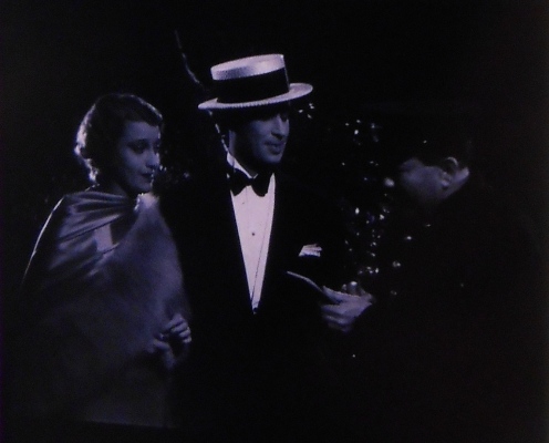
That’s because Universal’s 35mm print is tinted. Derived from a restored negative from UCLA Film and Television Archives, this version doesn’t include any new scenes, but around half of the footage is tinted sepia or lavender. (The remainder of the film is black-and-white.) That makes the print unusual in 2013, but hardly so in 1932.
The Basics
By now most cinephiles are already familiar with the delicate, beautiful tinting and toning summoned to tremendous effect in silent films like The Bluebird, Broken Blossoms, J’accuse, and Upstream. No less than silent pantomime or the elegant, economically-phrased intertitles, color effects constitute a major component of this lost art.
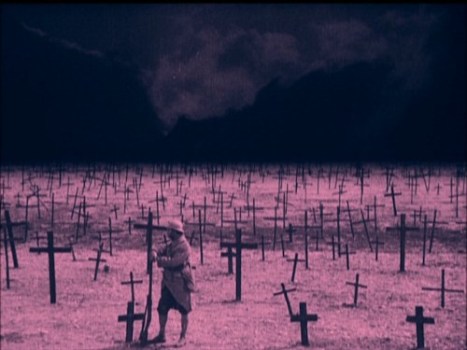 The effort involved in tinting and toning is astonishing. Tinting could be achieved by immersed already-exposed and -developed rolls of positive film in dye bathes. Simple enough, so long as you wanted only one color; if you wanted multiple colors over the course of a film, each roll had to be dyed in a separate bath. Negatives were assembled in tinting order (i.e., all the blues scenes strung together, next all the sepia scenes, then all the verdante scenes etc.) and printed, processed, and tinted accordingly. Scenes would only be spliced together back in the proper continuity order at very end—a very labor-intensive workflow, since it had to be performed on every single print that shipped out.
Since tinting was done after the image had already been exposed and developed, it filled in the lighter areas of the frame—hence blue skies, amber pastures, etc. Toning, by contrast, actively replaced the silver particles on an exposed and developed print with assorted color chemicals, which colored in the darker areas of the picture. Like tinted prints, toned prints required methodical scene-by-scene assembly after the fact. In combination, though, these processes could produce startling results, such as a pink tint and a dark blue tone for a sunset scene.
For many years, silent films were seen in substandard black-and-white prints, the coloring deemed too expensive or superfluous to replicate. (The instability of the dyes used in Eastmancolor prints and negatives was likely another factor.) A concerted effort on the part of studios, archives, scholars, and private collectors has made the restoration of color tints and tones a top priority in recent years, with some archives revisiting earlier restorations purely to address the color issue.
Most tints and tones are restored by printing to color internegative or flashing the new print prior to development—or adding colors to the Digital Intermediate or video master. Two laboratories—UCLA and Bologna’s L’Immagine Ritrovata—have actually resurrected the original process, dyes and all, to generally pleasing results. Among the modern dye prints to recently play in Chicago: The Adventures of Prince Achmed at the Music Box last year and Flower of Doom at the Gene Siskel Film Center during the last touring edition of the UCLA Festival of Preservation.
 Where Has All the Color Gone?
Tinting and toning fell into disfavor toward the climax of the silent era. As the film industry became increasingly capitalized, a veneer of sophistication took hold as well. Tinting may have been fine in the primitive nickelodeon days back when pictures were pitched at excitable, illiterate immigrants, the thinking went, but big business called for something cooler, less pronounced in its emotional appeal, more grown-up. (By the mid-1920s, the proportion of tinted product released by a given studio was a crude but accurate barometer of that outfit’s prestige.)
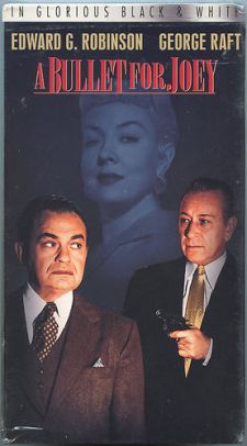
It’s only natural to assume, then, that the talkie revolution dealt a deathblow to tinting and toning. Certainly the reputed Golden Age of Hollywood is synonymous with “Glorious Black and White”—the marketing moniker devised by Turner Entertainment to sell vintage VHS tapes (and make nice after the company’s ill-fated colorization putsch) in the 1990s.
There were also substantial technical hurdles to tinted and toned talkies. The color processes, which achieved artisanal results on an industrial scale during the silent era, could not be readily translated to the new medium. To produce decent, audible results, a projector’s sound head had to “read” the information on the optical soundtrack. If the addition of a tint altered the contrast of the optical soundtrack, the range and character of the recording would be substantially affected.
The prospect of cutting and assembling every release print must also have sounded daunting to the studios—talkies were bringing in boffo box office, but production costs had increased right alongside receipts. Cinema, once mechanical, was now essentially electronic—with the precision and expense that implies. Many studios, too, were facing capital crunches as overextended gambles (like Fox’s theater-buying spree and its grandiose plot to purchase M-G-M) and simple Depression economics took their toll. Dropping the cumbersome, disreputable headache of tinting and toning would seem like a wise move.
But that’s not exactly what happened. Though tinted and toned talkies have minimal purchase on our collective memories, they were by no means rare. We recently spoke with Anthony L’Abbate, Preservation Officer at George Eastman House and a leading expert on the forgotten process, about this curious historical amnesia.
KW: I think when most people think of classic Hollywood—especially movies from the 1930s—they tend to think of something strictly black-and-white. Is that supposition wrong?
AL: I think that is a very true statement. Everyone knows that the world was in black and white until Gone with the Wind and The Wizard of Oz in 1939. Even though there were a number of natural color (Technicolor, Multicolor, etc.) films made in the 1930s, they were in much fewer numbers than monochromatic films.
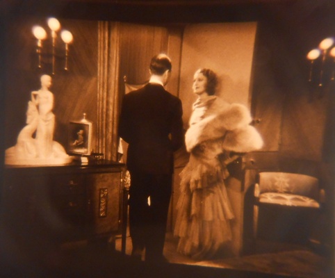 Enthusiasts of classic Hollywood films are 99.9% of the time not seeing original nitrate release prints – they see prints made somewhere between the 1950s and the present day. [Or they see them on home video. — Ed.] If original nitrate release prints were on pre-tinted stock (Sonochrome) or were chemically toned in the laboratory, the safety copies that were made for reissue or television distribution years later were always black-and-white. Even though color television was introduced in 1954, it was a basically black-and-white medium for over a decade. As television was the main outlet for old films, it just didn’t make sense to spend the extra money to copy the films onto pre-tinted stock or to make new sepia prints. Here’s an example: even as early as 1949 when The Wizard of Oz (Victor Fleming, 1939) was first re-issued, the prologue and the epilogue, which were originally sepia toned, were printed onto ordinary black-and-white film.
KW: How widespread were tinted talkies?
AL: It’s difficult to say. Very few original nitrate release prints survive (or survive complete), so a major resource is lost to us today. And the survival rate for original scripts and continuities is nearly as poor. Through my research I have found that tinting and toning was not only used in feature films, but in the entire range of short subjects as well, from live action, fiction shorts to travelogues, cartoons and even newsreels. For just the decade of the 1930s, I know of 70 features and 106 short subjects that were either wholly tinted or toned or featured sequences that were tinted or toned. Some had combinations of tinting and toning. It surprises many people—scholars and film buffs alike—to learn that original release prints of Dracula (Tod Browning, 1931) were on green tinted stock, or that the Marx Brothers film A Day at the Races (Sam Wood, 1937) had its two big musical numbers toned: the ballet was toned sepia and the “venetian waters” number was toned blue.
KW: Was tinting just a hold over from the silent days?
AL: I wouldn’t say the tinting was “just a hold over.” Tinting was an accepted practice of filmmaking in the silent days that audiences expected. Movie audiences knew the “language” of tinting. There were literal applications, like blue for nighttime scenes or yellow for daylight, but also emotional ones as well, such as red for anger and purple for passion. Just because films had added sound, there was no reason for the practice to end.
KW: I’ve read that tinting was abandoned with the introduction of sound because the process distorted the soundtrack.
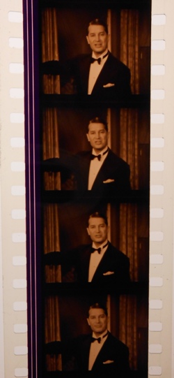
AL: It is true that some of the dyes used in the tinting of silent pictures did cause distortion. The solution to this problem was the manufacture of new pre-tinted film stocks with dyes that would not cause distortion on the optical sound track. In 1929 Kodak introduced Sonochrome—sixteen pre-tinted stocks, with colors ranging from pale pastels to deep and vibrant shades.
 Film historians and some books on film history have called Sonochrome a horrible failure and very little used. If this were true, Kodak would not have kept producing Sonochrome stocks up through the late 1960s, when they were predominantly used for advertisements and snipes. If Sonochome was a failure and there was no demand, DuPont would not have introduced their own pre-tinted film stocks.
Pre-tinted stocks received a boost in the late 1930s when John M. Nickolaus developed a new sepia toning process at the M-G-M laboratory: Sonochrome stock was used to achieve a two- and sometimes three-color effect. The effect wasn’t limited to M-G-M, either. For example, the Columbia film Arizona (Wesley Ruggles, 1940) used Sonochrome “Firelight” red-tinted stock, which was then toned sepia to produce a two-color effect.
KW: How did you become interested in tinted talkies?
AL: I started really researching this topic in the summer of 2008 when the 1933 Fox Film I Am Suzanne! (Roland V. Lee) was brought to my attention. My colleagues were excited by the fact that it was a tinted talking picture, which we believed to be a rarity. I had only known of a few sound films that had been tinted, so I wanted to see what critics said about the tinting in I Am Suzanne! In all the reviews that I read about the film, none mentioned tinting.
So I went and looked up the reviews for One Hour With You (Ernst Lubitsch, 1932), another film that I knew had tinted sequences. [The tinted version of One Hour With You was issued on laserdisc, though the tints were curiously dropped for the DVD edition — Ed.] Again nothing was mentioned. That is when I started to put two and two together and realized that if the critics are not mentioning this rare coloring, maybe it wasn’t rare and that tinting didn’t really end with the coming of sound.
KW: What’s your process for researching tinted talkies?
AL: I am fortunate to be working at George Eastman House, where we have access to a sizable collection of nitrate films, so I am able to look at original release prints. I was able to inspect David O. Selznick’s personal print of Bird of Paradise (King Vidor, 1932). While his copy—which was made in the early ’40s—was only in black and white, all the reels had notes like “Candleflame,” “Verdante,” “Firelight,” and “Peachblow” scrawled in the leader, indicating the Sonochrome stock to be used. I have friends and colleagues in every major U.S. archive and they let me know when they come across a tinted / toned sound film.
 Cutting continuities, when they survive, have been useful for giving me information about how films looked on their original release. It was from a cutting continuity that I discovered that original release prints of Anna Christie (Clarence Brown, 1930) had been printed on DuPont lavender pre-tinted stock.
I also read lots of contemporary reviews. After M-G-M introduced their toning process in the late 1930s, Variety was usually good at mentioning if a film was toned or tinted. Visiting and revisiting historic newspaper websites will often bring some hits when I search with terms like “sepia tone,” “sepiatone,” “red tinted film,” etc. It’s like looking for a needle in a haystack. And reviewers were not always consistent in mentioning if a film was artificially colored.
KW: Archivists usually have a few go-to sources for contemporary reviews—the bound collections of Variety and New York Times reviews, which were published for the library market in the 1970s and ’80s. Early trade journals like the Motion Picture World have been available on microfilm for a long time, but there’s so much more out there. So many small town newspapers have been digitized and become searchable. So much data to aggregate.
AL: A “red tinted film” search on a historical newspaper website brought up reviews from Lima, Ohio and Corsicana, Texas, that mentioned that the hell sequence in Dante’s Inferno (Harry Lachman, 1935) was printed on a light red stock. A search for the word “sepia” turned up a 1945 New York Times editorial from a man in Queens who complained that films were no longer sepia toned. (The process stopped towards the end of World War II because uranium—one of the chemicals needed for toning—had been restricted for civilian use by the government, who needed it for the atomic bomb.) He also mentioned how impressive the toning was in films like The Prisoner of Zenda (John Cromwell, 1937). That was the first that I heard that Zenda was toned. Reviews confirmed that it was released with sepia sequences. We have some reels of the film in collection at the Eastman House, so I was able to see the toning first hand.
KW: If modern audiences want to see the effect for themselves, which restored films would you recommend?
AL: Hell’s Angels (1930, Howard Hughes) has tinting, a tinted and toned sequence, and even a two-color Technicolor sequence. Mighty Joe Young (Ernest B. Schoedsack, 1949). Portrait of Jennie (William Dieterle, 1948) has tinting, toning, and some Technicolor. Those would be my top three picks, chosen for ease of availability on home video.
KW: Of course, there are still many, many films missing their original tints and tones. Any in particular that you’d like to see restored?
 AL: My list would begin with the 1937 Eddie Cantor film Ali Baba Goes to Town (David Butler). This was one of two films that used a three-color tinting-toning combination of Sepia-Amber-Copper for daytime scenes and Blue-Orange-Copper for night scenes. Likewise The Firefly (Robert Z. Leonard, 1937) used Sepia-Blue, Sepia-Orange and Sepia-Blue-Pink. These two films used the process to its limit; no other films were so ambitiously colored. I would also loved to see the light red tint restored to Dante’s Inferno. But to be honest I would love to see all the films that had tinting and toning restored.
KW: Obviously, this is something that goes well beyond trivia for you. Does the tinting and toning enhance the emotional or aesthetic experience for audiences? What makes tinting worth talking about?
AL: I think tinting and toning would enhance the emotional experience. Think of what it would be like to see Dracula in a darkened theater with a green tint to add to the creepiness. I know it definitely enhances the aesthetic experience. I just saw a sepia 35mm print of Cabin in the Sky (Vincente Minnelli, 1943). Having only seen the film on DVD in a black-and-white copy, it did not really hold my attention. Seeing it on the screen in a sparkling, sepia toned print, it sprang to life in a way in which I was not expecting. I sat in the back of the theater in an aisle seat, thinking I would leave after the first reel. I left the theater after the end credit faded from the screen.
Now I’m a bit biased on the subject, but I think it is worthwhile to talk about tinting and toning in the sound era, because it is so forgotten. And the more people are educated on the subject, the more that these films will be restored to their original appearance. And possibly more information will be uncovered leading to further discoveries on this topic.
