Between fuzzy adolescent memories and Amazing Dreamcoats, getting a real fix on Technicolor has always been difficult. A dizzying example of total branding supremacy, Technicolor was not just a process but cultural shorthand for a certain kind of overripe, retina-scarring engagement with the world around us. (It was a Hollywood fantasy, and an irresponsible one.) With the name used as adjective to describe anything from a candy store to a brilliant automobile, it’s time to husk away the shades of grey.
Admittedly, the Technicolor brand and process have hardly been static. A film proclaiming ‘Color by Technicolor’ meant something very different in 1923 than it did in 1928, 1937, 1960, or 1985. These days, Technicolor describes itself as a ‘Technology-driven company for Media & Entertainment.’ It doesn’t make film prints anymore but instead nurtures a massive post-production and logistics infrastructure that encompasses everything from Digital Intermediate work to distribution of DCP hard drives. Still, the American moniker was iconic enough that Thomson, the French firm that acquired the company in 2001, eventually re-named itself Technicolor.
The earliest Technicolor films do not survive, but we still have many examples of the ethereal two-color process that the company pushed in the twenties and early thirties. (We especially recommend the two-color sequences in The Wedding March and Ben-Hur and the totally Tech Doctor X.) But the ‘Glorious Technicolor’ of official nostalgia is something else again. The classic three-strip Technicolor system was enormously complex, with three separate but simultaneously-shot camera negatives kept in registration through production, editing, and printing. The camera stock was itself black-and-white, but when photographed through an elaborate filter system, each strip yielded a monochrome image whose slightly divergent density characteristics suggested a very robust approximation of the original color information.
Distribution prints were manufactured through distinctly un-photochemical means. Technicolor’s process—known as imbibition to insiders and nerds everywhere—instead resembled lithography: each color record yielded a corresponding matrix roll, which, in turn, transferred Technicolor’s distinctive dyes, layer upon layer, to the final copy. In essence, each color was printed on the film, one after another. It was no wonder that Technicolor’s individual hues often took on a hard, material presence. These colors really popped.
Although few argued with Technicolor’s final product, the 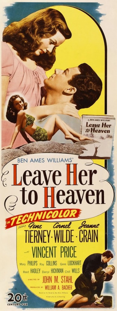 process remained expensive and cumbersome. (For editorial staff and latter-day asset managers, it also meant three times as much film to inventory, evaluate, and catalogue.) The introduction of Eastmancolor in the early 1950s seemed an ideal alternative: with its single strip color negative, the new process yielded a sharper image at considerably reduced cost. The process could also yield a reasonably good color release print. By 1955, three-strip shooting was phased out entirely in Hollywood. (Some studios re-christened the phlegmatic ‘Eastmancolor’ into more sonorous trade names, like Metrocolor and Warnercolor. Don’t be fooled: under the hood, it’s the same process.)
Miraculously, Technicolor continued to produce release prints for another twenty years, modifying their process slightly to accommodate films shot on Eastmancolor negative. Though Eastmancolor introduced real efficiencies during production and post- production, the fully-conformed final cut could easily support the manufacture of separation matrices very late in the game. Splitting the color information contained on the single-strip negative into three matrices, Technicolor effectively simulated the three-strip workflow from scratch. (With red, green, and blue records confined to separate film strips, the process also allowed considerably greater latitude in color adjustment.) The cheapness of Technicolor’s dedicated release print stock—which was essentially a blank receptor, in contrast to multiple layers of photosensitive emulsion embedded in raw Eastmancolor stock—proved its salvation. Though the upfront cost of preparing separate matrices from single-strip negatives was not trivial, the expense was also not prohibitive when large release print runs were required.
Some studios, like Paramount, doggedly held on to the Eastmancolor negative/Technicolor release print model for years. Others, like Twentieth Century-Fox—which had a considerable financial stake in rival DeLuxe Laboratory—abandoned the Technicolor process entirely in short order. (Though dozens, if not hundreds, of labs across the country could make Eastmancolor prints, Technicolor print runs were kept in-house, stripping the studios of another aspect of control.) By 1975, Technicolor’s US facilities ceased production of imbibition prints; like everyone else, they took up conventional photochemical printing. (Some imbibition prints were still manufactured in England and China in the years following, but the age of imbibition was effectively over.)
For film collectors, Technicolor has long held a singular attraction. The prints are known by various interchangeable codenames—Tech, IB, dye transfer—but the appeal is uncontested. Whether through calculation or happenstance, the Technicolor dyes retained their saturation and color properties through the decades. With Eastmancolor prints inevitably fading to magenta (sometimes only five years after manufacture!) and rare Fujicolor versions frequently turning purple and measly, Technicolor copies proved a remarkable investment. (Some persnickety film archivists caution that it would be improper to flatly declare that “Technicolor doesn’t fade.” Fair enough; like Kodachrome prints, if Technicolor copies are fading, it’s on an imperceptible, superhuman time scale.)
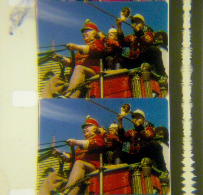 But Technicolor prints have value beyond their stability. Simply stated, the colors on view in a good IB copy represent a certain plateau of color cinematography. It’s hard to describe to the uninitiated, but here goes: Technicolor prints have a distinct ability to present a gobsmacking spectrum of color while also making each individual hue somehow distinct. You can read it as a single picture, or take in independent islands of color. (It’s not uncommon to overhear comments like “Did you see the Purple of that dress in the third reel?” or “I couldn’t believe the Yellow in those bales of hay!” from IB partisans following a Technicolor screening.) Everything has a presence that other color prints—let alone digital copies—can only suggest.
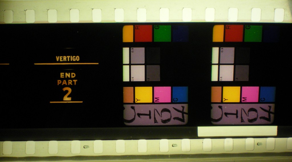
For programmers, Technicolor prints offer something else. Despite their scratches and splices and other artifacts of age, Technicolor prints promise films in the sympathetic light of their original stature. They are unmediated by the deterioration of original elements, subsequent (and often inaccurate) lab work, modern film stocks, and a host of other necessary stumbling blocks in the restoration process. (It’s important to emphasize that, despite a short-lived revival in the late nineties, the imbibition process is effectively lost to us; new IB prints literally cannot be made without some intrepid freak reverse-engineering the entire process, dyes and all.) In the case of a film like Vertigo, with a controversial 1996 restoration effectively altering its visual and especially aural character for a new generation, an original IB Technicolor print is the only real way to reckon with what audiences in 1958 experienced. (It was extremely heartening to see both screenings of the elusive IB Vertigo sell out at the Gene Siskel Film Center last month.)
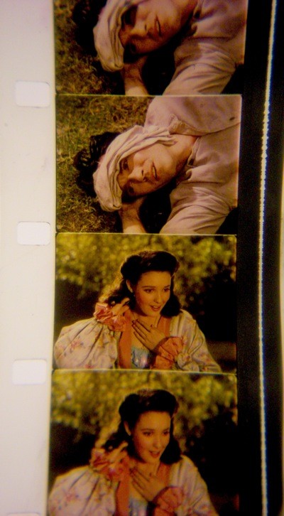 Pinning down IB prints is harder than it might initially appear. Just because a film carries a Technicolor credit does not guarantee a dye transfer beauty. Many films initially released in IB versions were printed Eastmancolor on reissue, with the Technicolor credit retained. This is equally true of modern prints manufactured on Kodak 2383 low-fade color stock.
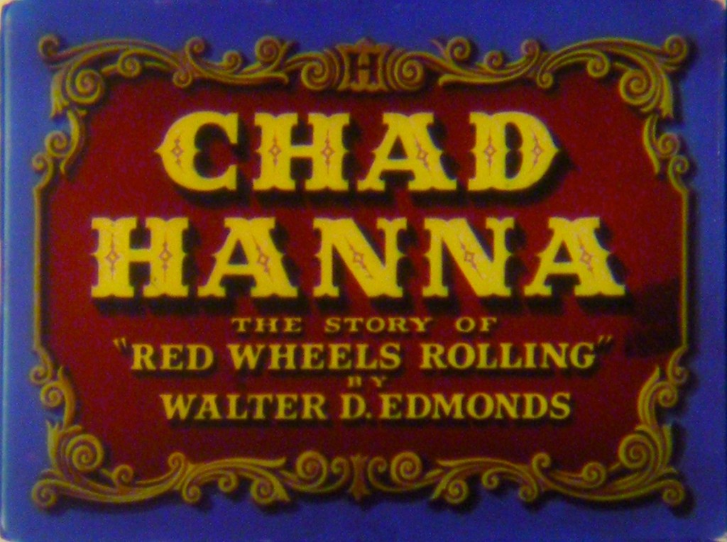
More complicated is the subject of three-strip productions with checkered preservation history. Our choice of a 16mm IB print of Chad Hanna this Wednesday was guided both by the luster of this particular copy and the unique limitations of the alternatives. We know of one 35mm Eastmancolor Chad Hanna print that’s completely faded to pink. There’s another, privately-owned 35mm copy we’ve seen that does its best with problematic elements. When Fox performed an initial round of preservation work on its library in the 1970s, the protection negatives were often made on the also-unstable Color Reversal Internegative stock—with the nitrate originals destroyed after duplication. (Fox wasn’t the only studio operating on this model and the decision should be weighed against the prevailing practices of the time.) So, instead of a decomposing nitrate negative to work from, modern-day studio asset managers have an irregularly-faded CRI of slightly more recent vintage. The result is a final print with wild and unappetizing swings in color temperature, contrast, and saturation. Recent strides in digital restoration make corrections easier, but expensive, especially for a marginal title like Chad Hanna.
So, in the end, the IB Technicolor 16mm print—struck before the production of inferior Eastmancolor prints and the manufacture of imperfect preservation elements—proved the best option for us. We dare you to disagree after seeing it on the big screen.
The Northwest Chicago Film Society will be screening Chad Hanna in a vintage IB Technicolor 16mm print at the Portage Theater on Wednesday, October 3. (There’s a Presidential debate that night, but those occur much more regularly than theatrical screenings of Chad Hanna.) Please see our current calendar for more information. Special thanks to Brian Block of Criterion Pictures, USA and Jim Healy.

