 Sometimes even I wish that the digital conversion would just hurry itself up, if only so that we could forever forsake the journalistic convention of punning on matters of real and reel. You know, or could make up, the headlines: Professor examines reel history, Local woman finds reel love, Reel inflation fears send real a-reeling.
What this ubiquitous usage tends to do is lay down a bright line between movies and everything else, as if even eight-figure corporate deals are a bit precious and fantastic because they touch the movie business. (If only I could quit my real job and get a reel one…) We’re still living in the dream factory, even when those dreams are increasingly violent and downbeat.
A generation from now, the reel might lose its currency as an imaginative symbol. Right now, though, it still stands in for the broader idea of the movies: look no further than the logos of your local film festival, film commission, or indie video store. All this despite the fact that most people have never handled a reel of film. Walk around a theater lobby with a 16mm Castle Film before the show and see just how many people think you hold an entire feature in the palm of your hand. More realistically, a two-hour feature would encompass six or seven 35mm reels about 14 inches in diameter apiece.
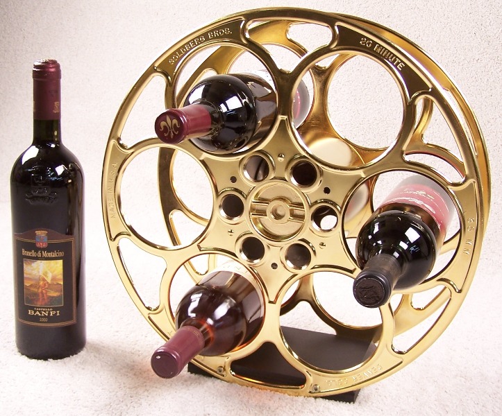
 Significantly, Denver-based Goldberg Brothers, which has produced metal reels and other exhibition essentials for decades, now cannibalizes and parodies its own market. Its website includes two divisions: Commercial Products and Decor Products, the latter hawking reel-themed wine racks, end tables, clocks, wall doohickeys, etc. You can order similar products from Skymall—authentic entertainment memorabilia for your basement DVD oasis.
But reels are important—an unexamined unit of understanding the 20th-century cinema. Very few filmmakers knowingly utilized the measure for aesthetic ends, though Andy Warhol’s made-to-order cinema certainly did. The early silents are all assembled from unedited 100 ft. rolls of camera-original reversal stock and the talkies generally run 33, 67, or 100 minutes—depending on how many 1,200 ft. reels comprise a given feature. (You can tell it’s literally the entire reel when the final frames of image are marked by a series of circular holes punched out by the lab to identify each roll—frames that would be trimmed and junked by almost any other filmmaker.) The range of content is dictated not by plot contrivance or budget, but by bluntly material concerns.
Thinking about movies on the reel level provokes a salutary disorientation. For one thing, it shifts the conversation away from the director or producer’s artistic intent (disputable, often unknowable, frequently unedifying) to a concrete examination of what audiences saw and how it was constructed.
These days, filmmakers shift between color and black-and-white, 35mm and Super 8, fine-grained film and blocky surveillance camera video, wide and narrow frames, as if their stylistic credentials depended on it. (Think of Oliver Stone, Darren Aronofsky, David Fincher, Robert Zemeckis, or Alejandro González Iñárritu.) This is made easier by digital workflows, which allow all of these things to be integrated (or created) conveniently during post-production.
But for most of film history, such formal promiscuity represented a real balancing act between artistic conception, laboratory acumen, and exhibition practices. The automated multiplex age has eliminated the possibility of something like Henri-Georges Clouzot’s Mystery of Picasso, which requires the projectionist to switch from a flat 1.37:1 lens to an anamorphic 2.35:1 one for the ultra-wide final reel, hopefully coordinated with a well-timed opening up of the curtain or screen masking. The earlier Magnascope process called for an enormous magnification of the screen image during select sequences through use of a turreted lens configuration. (Generally thought to be confined to a few Paramount silents like Old Ironsides and Wings, the process actually had a much longer and more diverse lifespan, as ongoing research by Anthony L’Abbate demonstrates.)
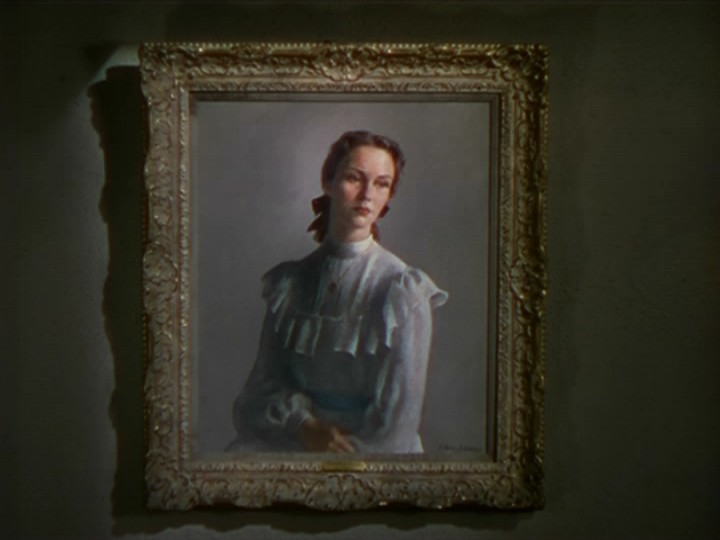 Combining color and black-and-white was a labor-intensive choice in a different way. When three-strip Technicolor was still a luxurious and expensive option in a generally black-and-white world, a few seconds of color could sometimes provide a real jolt. Albert Lewin made this his trademark in the 1940s, with brief inserts (Cinecolor for The Moon and Sixpence, Technicolor for The Picture of Dorian Gray and The Private Affairs of Bel Ami) literally spliced into otherwise monochrome shows. Decisions like this meant a real disruption in business-as-usual labs and exchanges: instead of simply printing a negative from end-to-end on a single stock and then sending it off to the theater, someone had to wind through the given reel and splice in a few feet of color footage into each and every print at a precise, frame-specific position. Instead of an orderly negative-positive operation, this entailed intervening and assembling the final product from literal scraps with a vial of cement. David O. Selznick’s Portrait of Jennie was even more complicated: the final 1,000 ft. reel included three different print stocks—green-toned monochrome, brown-toned monochrome, and a few seconds of full Technicolor for the titular portrait. Combine these shifts with the fact that the final reel was conceived for widescreen Magnascope projection (the rest of the show was standard 1.37:1 black-and-white) and Portrait of Jennie looks more like a disruptive avant-garde piece than a standard-issue work of commerce.
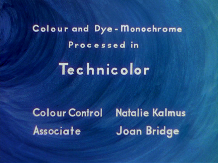
Other productions like Powell and Pressburger’s A Matter of Life and Death posed a different set of challenges. Since several scenes fade from color to black-and-white and vice versa, a simple splice would not suffice. All prints still carry a credit for Technicolor’s proprietary dye-monochrome process, which presumably applied black-and-white images to the blank film strip in the same quasi-lithographic manner as color ones. However, viewing an original nitrate print would be the only way to assess the effectiveness of this process, as all modern prints simply print the black-and-white sections on standard color stock. This isn’t corner-cutting: the original process simply cannot be recreated with modern equipment.
 The development of the cheaper (and fade-prone) Eastmancolor eventually supplanted Technicolor for chromatic cinematography and release-printing, but the problem of combining black-and-white and color was no simpler. Printing from a black-and-white negative to color release-print stock rarely yielded a pure black-and-white image, even with good faith effort from the lab. The emulsions are chemically different and require distinct processing workflows. A filmmaker who wanted to switch between black-and-white and color had two choices: splicing back and forth between stocks on hundreds of release prints or accepting a streamlined process that rendered the black-and-white scenes with a tinge of blue or yellow or brown. (I’ve seen black-and-white scenes in all these variations—the accuracy or deviation being a reflection of the skill and temperament of the laboratory’s color timer.)
Original 35mm prints of Raging Bull opted for the former route, the color home movie footage spliced into each and every otherwise b&w print. This yielded a more accurate palette, but looked aberrant enough for at least one projectionist to splice out the color footage. According to editor Thelma Schoonmaker, the projectionist assumed that the lab had accidentally inserted another client’s home movies (in 35mm?) to the Raging Bull release print and took it upon himself to correct the error.
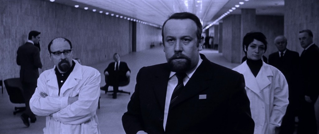 When transferring these films to video, these details matter. Criterion’s Blu-ray of Wings of Desire switches between pure black-and-white and vibrant color, which is either an improvement upon or a distortion of the original theatrical experience, depending on your tastes. The same company has switched its position on Andrei Tarkovsky’s Solaris. On its first DVD release, the b&w scenes were rendered as such after Criterion consulted cinematographer Vadim Yusov and determined that long-standing blue tints were a lab error; the subsequent Blu-ray and DVD reissue reverted the monochrome scenes to blue. Perhaps a lab error that might be better understood as a lab norm inextricably linked with presenting something like Solaris in 35mm, whether in 1972 or 2012.
Again, it makes sense to separate intent from the economic forces that dictate the final product. In the silent era, it was simply accepted practice that each print be positive-cut—that is, the final continuity was not established in the negative but assembled piece-by-piece in each release print. Because silent films often utilized an array of tints and tones, with each color developed in separate chemical baths, the prints were struck in tinting order and re-cut to narrative order afterwards. Each print represented a significant investment of labor and craft (and an exponentially increased risk of the heavily-spliced print breaking or buckling at hundreds of vulnerable points.)
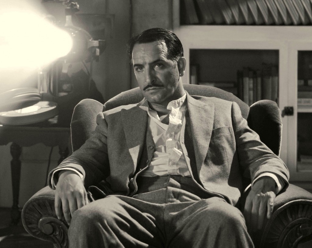 Compare this to the rollout of a modern silent like The Artist. All the 35mm prints are printed on polyester color stock (Kodak 2383), even though high-quality black-and-white polyester stock is still available (Kodak 2302). Though the stock itself is not significantly more expensive, printing it at Deluxe’s high-turnover plant is. With black-and-white processing in low demand, keeping a dedicated processing line for such orders is impractical. When a black-and-white order does come in, taking a machine offline to switch out its processing chemicals is a costly proposition that disrupts normal productivity quotas. Very few clients are apt to shoulder this premium, and so something like The Artist (or Weinstein’s other recent monochrome feature, Control) goes out in blue-and-white prints. Because there’s some inherent shift in color temperate from one reel to another, the 35mm version of The Artist switches ‘tints’ every twenty minutes or so. Each print is an amalgamation of uniquely shaded reels. By comparison, the DCP version of The Artist is reportedly straight b&w—the simplest of 1927 laboratory practices ‘only’ available digitally these days.
A simple lesson to draw here would be that digital is inherently more flexible, accurate, and cost-effective. But this conclusion treats film history in a backwards and unproductive fashion—decades of analog innovations simply groping towards something that digital would cleanly fix, a century-long evolution that ambles towards a pre-determined point. But thinking about a tradition of labor practices and cinematic crafts in this manner (posing them against a phantom future alternative) denies them the weight and logic that originally characterized them. The further we move away from photochemical filmmaking, its solutions, challenges, work-arounds, and tricks looks all the more complex, admirable, and irretrievable.
This post is part of an ongoing series about the consequences of the current wholesale conversion of cinema exhibition from film projection to digital presentation. Read our earlier entries here, here, here, and here.

